
How to Dynamically Split Data in Power BI
Managing Data in Power BI
When building reports in Power BI, the main aim is to convert the thousands to millions of individual numbers in your data into one bite sized and manageable piece of information. This is why we "slice" our data using dimensions to help us better understand what our data is telling us. Questions such as how much have we sold of this product, how much did we spend last month, or what is our busiest time of the day are all common use cases that Power BI dashboards help businesses answer using standard filters and fields.
However, what about more specific data groupings that are not built into your data, questions like:
- How many customers purchased between £2k and £5k with us last year?
- How many customers had a single purchase over £1k
- How many customers order with us at least once a month?
These groups tell us who are our most valuable customers are and who we might want to target - but they require a bit more effort to identify because we can't simply "slice" our data to get the answer.
These types of queries help identify our high-value customers and who we might want to target. But to achieve it, we need to dynamically group and filter the data: something that requires DAX, custom measures, and Power BI modeling techniques.
Measuring Up in Power BI: Create Bespoke DAX Measures
To answer these types of customer segmentation questions, the simplest way of achieving that is by writing a bespoke DAX measure with hardcoded values inside of it. A Power BI measure allows you to summarise the data and then filter it accordingly, helping you extract exactly what you need.
Analysts will probably be very familiar with writing DAX formulas like this, however while they do a job, they really only answer one question. Ideally, what we want to do is write a dynamic measure that can be reused across reports, and also allow report builders to build interactive dashboards for their users. What we need is to tie the bespoke measures that have been created in to values that allow us to cut and slice the data.
Disconnected Tables: Your Data, Your Way
In order to achieve the above, we need to group the data dynamically so that the measures can do their thing. In most instances, the groupings that you use in your Power BI reports are going to be your business language built into the report model (Product, Customer etc). However, when we are trying to build a report where the language doesn't exist, you are going to need to create it, and the way to do that is by using a disconnected table.
As the name suggests, a disconnected table in Power BI is a table that isn’t connected to the rest of your data model in a meaningful way. It’s simply a reference table in your model containing the buckets or value ranges that you want to use, which will look something a bit like this:
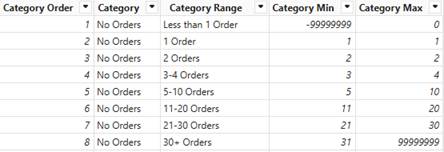
The above can be created by simply inserting data manually, or could be by linking to a data source such as an Excel source. An excel book would give you increased flexibility so that you can amend or add to your groupings on the fly, but what really matters here is having the minimum and maximum fields. These drive the logic in your DAX measures and allow cutting and slicing the numbers in the measures you create.
Bucket Measures in Power BI
With the disconnected table created, you are then ready to create bucket-based measures in DAX. These measures are driven by the values from your disconnected table, so you can add to these as you see fit - however its important to note that there are many ways to write measures, and this is not the only answer. You should keep an eye on the performance of the measures and if they are not performant then revisit them.
Working Example: Power BI Measures in Practice
How to write a measure to group customers based on total spend
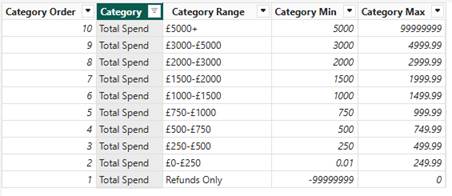
In order to create a measure that allows me to answer a question such as show me the customers who have purchased between 2k and 5k, I create a disconnected table with the following buckets:
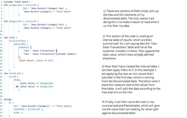
This is accompanied by the following measure, which is broken up into the following sections:
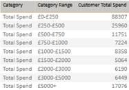
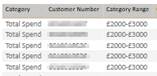
This allows me to group my spend in the following way:
Or even go down to specific customers, should you want to tailor a marketing campaign aimed at them:
Measure Switching
While the disconnected table is great for doing the above, they can also be used to create a more interactive report for the users through the use of measure switching. This is simply giving the users the option to choose the numbers that they would like to see in a visual, rather than being constrained by the one you used when the report was written. So for example:
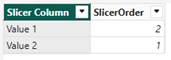
The Disconnected Table might look like this:
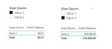
I can then write a switch measure like this:

Which then allows the user to dynamically switch the measure being returned by adding a slicer to the report:
Bonus: Let Users Personalize Visuals
It’s also worth being aware that the PBI service does provide a much more interactive option, which is not considered here, which allows to choose what reporting visuals are within their own version of the report. If that sounds like something you might be interested in, the following link will be very interesting to you!
👉Let users personalize visuals in a report - Power BI | Microsoft Learn
Wrapping Up: Deeper Insights with Power BI
In summary, hopefully this demonstrates the flexibility of Power BI; not just to present your data, but to mould it in ways that tell you things about your business that you didn't know. The technique we've explored using disconnected tables and DAX measures is flexible and reasonably simple - you just need to consider how you want to split your data to make use of it.
Got questions or want help implementing this in your own Power BI reports?
Feel free to reach out to Dolphin IT Solutions using the contact form below.
Let’s make your data work smarter.